The geo-blogosphere has been
buzzing about the
global Facebook friends visualization. This was done by
Paul Butler using an R script and some clever techniques for working with geodetic data.

This kind of lightweight spatial analysis and visualization is squarely in the target zone for
JEQL, so I thought I'd try something similar.
Of course I don't have access to the Facebook friends dataset, so I needed some other suitable dataset of global-scale links. An obvious candidate is airline routes. Luckily there is an excellent open data repository called
OpenFlights. It has datasets which are tables of airport locations and air routes between airports:
airports.dat:
1,"Goroka","Goroka","Papua New Guinea","GKA","AYGA",-6.081689,145.391881,5282,10,"U"
2,"Madang","Madang","Papua New Guinea","MAG","AYMD",-5.207083,145.7887,20,10,"U"
3,"Mount Hagen","Mount Hagen","Papua New Guinea","HGU","AYMH",-5.826789,144.295861,5388,10,"U"
...
routes.dat:
0B,1542,AGP,1230,BBU,1650,,0,738
0B,1542,ARW,1647,BBU,1650,,0,340
0B,1542,BBU,1650,AGP,1230,,0,738
...
The first step is to prepare a suitable dataset for rendering. To get a table of FROM/TO locations, the routes table needs to be joined to the airport table. This is trivial to do in JEQL. After a bit of cleanup (such as removing missing data and duplicate routes), the final result is a dataset of links between airport locations using Lat/Long coordinates:
28,"Bagotville","Canada",48.330555,-70.996391,146,"Montreal","Canada",45.470556,-73.740833
29,"Baker Lake","Canada",64.298889,-96.077778,132,"Rankin Inlet","Canada",62.81139,-92.115833
30,"Campbell River","Canada",49.950832,-125.270833,119,"Comox","Canada",49.710833,-124.886667
30,"Campbell River","Canada",49.950832,-125.270833,156,"Vancouver","Canada",49.193889,-123.184444
...
As Paul found, a few other steps are needed to produce a visually appealing map:
- Densify the route links to produce approximations to great-circle arcs
- Break the arcs at the International Date Line to allow them to render correctly
- Colour-theme the routes from longest to shortest using lighter colours for shorter routes
- Render the lines with longer ones further back in the Z-order
For good measure I also added a background rendering of world land areas, as well as a country boundary layer on top. To avoid swamping the map, only routes with more than one flight listed are displayed.
The rendering is done using the following JEQL script:
CSVReader troute hasColNames: file: "routeLine2.csv";

trte = select  fromCity, toCity,
  Val.toDouble(fromLon) fromLon, Val.toDouble(fromLat) fromLat,
  Val.toDouble(toLon)   toLon,   Val.toDouble(toLat)   toLat
 from troute;

tlines = select fromCity, toCity, line, len
 with {
   line = Geodetic.split180(Geodetic.arc(fromLon, fromLat, toLon, toLat, 2));
   len = Geom.length(line);
 }
 from trte order by len desc;

tplot = select line,
 Color.interpolate("f0fff0", "00c077", "004020", len / 200.0 ) lineColor,
 0.4 lineWidth
 from tlines;

//----- Plot world landmasses for context
ShapefileReader tworld file: "world.shp";
tworldLine = select GEOMETRY, "22222277" lineColor from tworld;
tworldFill = select GEOMETRY, "333333"   fillColor from tworld;

width = 2000;
Plot width: width height: width / 2
 extent: LINESTRING(-180 -90, 180 90)

 data: tworldFill
 data: tplot
 data: tworldLine

 file: "routes.png";
That's about 40 lines of code, with only 9 statements. Not a bad LOC score... Of course the heavy lifting of handling geodetic data is done by Java functions, but that's part of the point. JEQL makes it easy to link to Java code, since that's a more appropriate technology for creating performant, resusable code.
Here's the final output:
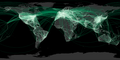
The continent outlines aren't revealed as crisply as the Facebook friends map. That's because friend links tend to be more spatially coherent than airline routes (unless your acquaintances all have private jets). But it certainly shows where the world hotspots are for air traffic. Boy, those Europeans love to fly!
Next up: the KML version...


